Looka
Web App
Logo Editor
SaaS
A redesign of Looka's AI-powered logo editor. Built for entrepreneurs creating their first brand identity, focused on reducing friction between logo generation and purchase.
Context
Looka's logo editor is where the AI hands off to the user. People arrived excited. The AI generated options instantly. The editor turned that momentum into friction.
Entrepreneurs making their first brand decisions were guessing at unlabeled tools, losing work they cared about, and giving up before they converted. The AI delivered on its promise. The editor didn't.
- Toolbar icons had no labels. Core tools were invisible to new users
- Font and symbol browsing required too many steps with no live preview
- Comparing logo variations one at a time made confident choices rare
- Key panels and features were buried, invisible without support
Original editor
Role
I worked across the entire company. Research and testing was done in-house with the full team. I partnered closely with the founder and CEO, the development team, PMs, and customer success.
Lead Product Designer, 2-month project
- End-to-end UX from research to ship
- Synthesis of five research streams: Fullstory, customer calls, Intercom/Typeform, Usertesting.com, and customer success feedback
- Design sprint facilitation: discovery, ideation, and sketching
- High-fidelity UI and interaction design
- Prototype and stakeholder validation
- Developer specs, red-line annotations, and handoff documentation
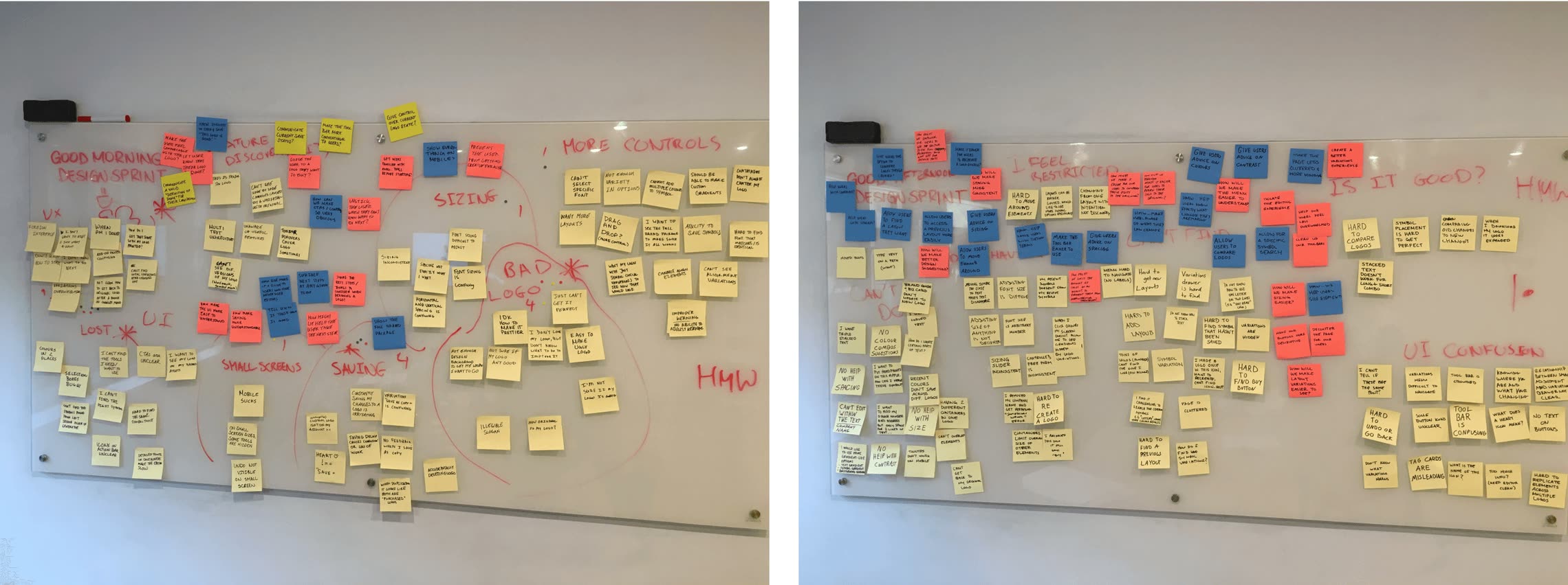
Design sprint: "How Might We" brainstorm session
Decisions
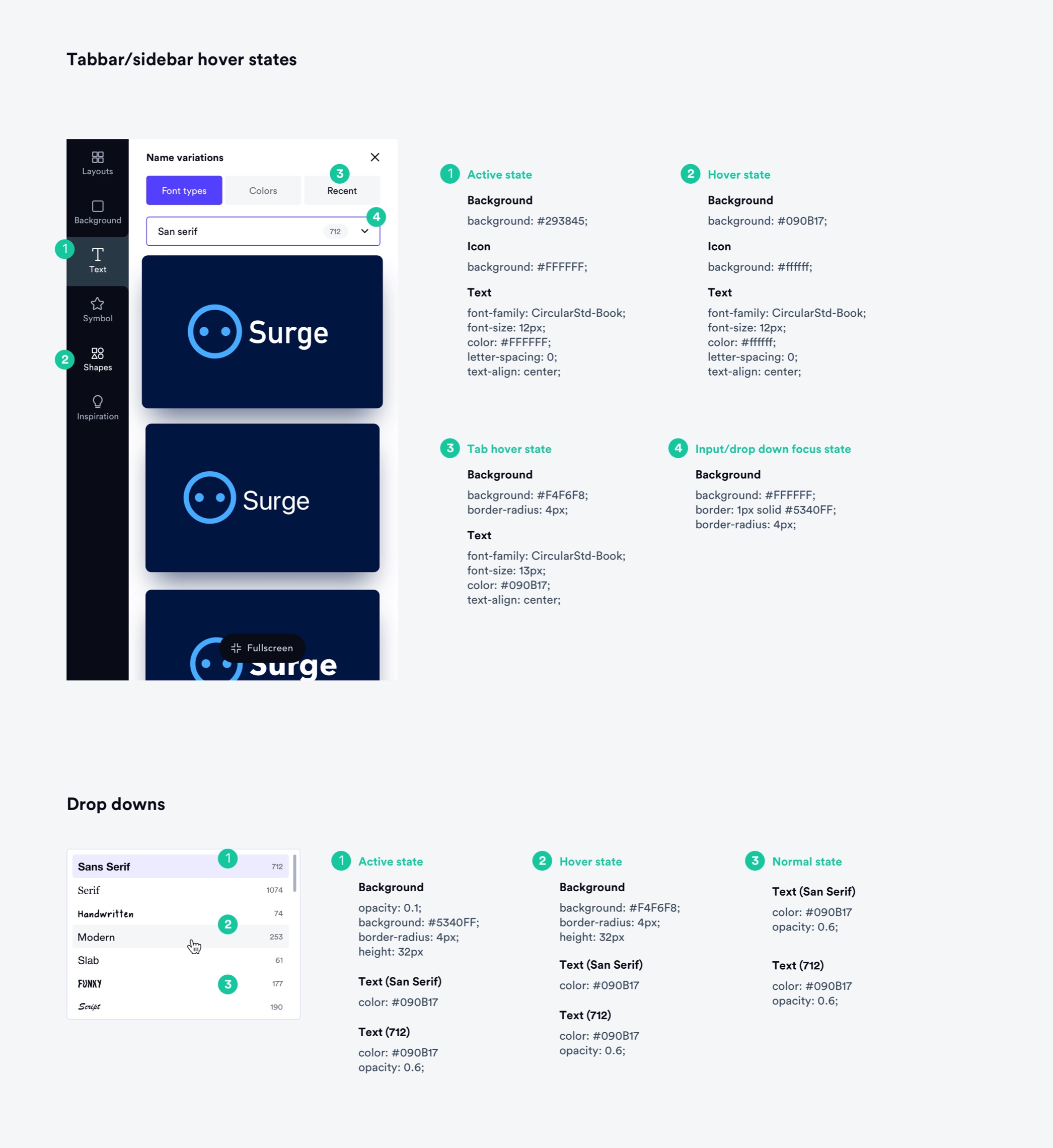
Labels on every toolbar icon. Prioritized clarity over minimalism. Looka's users are not power users. They're making their first logo. A label removes ambiguity at zero cost and builds confidence in the tool.
Side-by-side comparison modal. Replaced toggling with a direct comparison view. Toggling forces sequential evaluation. Comparison maps to how people actually make decisions, holding two options in mind at once. This was the single highest-impact change for conversion.
Version history as a creative safety net. Users who feared losing their work didn't explore freely. Once history was in, we saw bolder edits and more time iterating. Exactly what conversion needed.
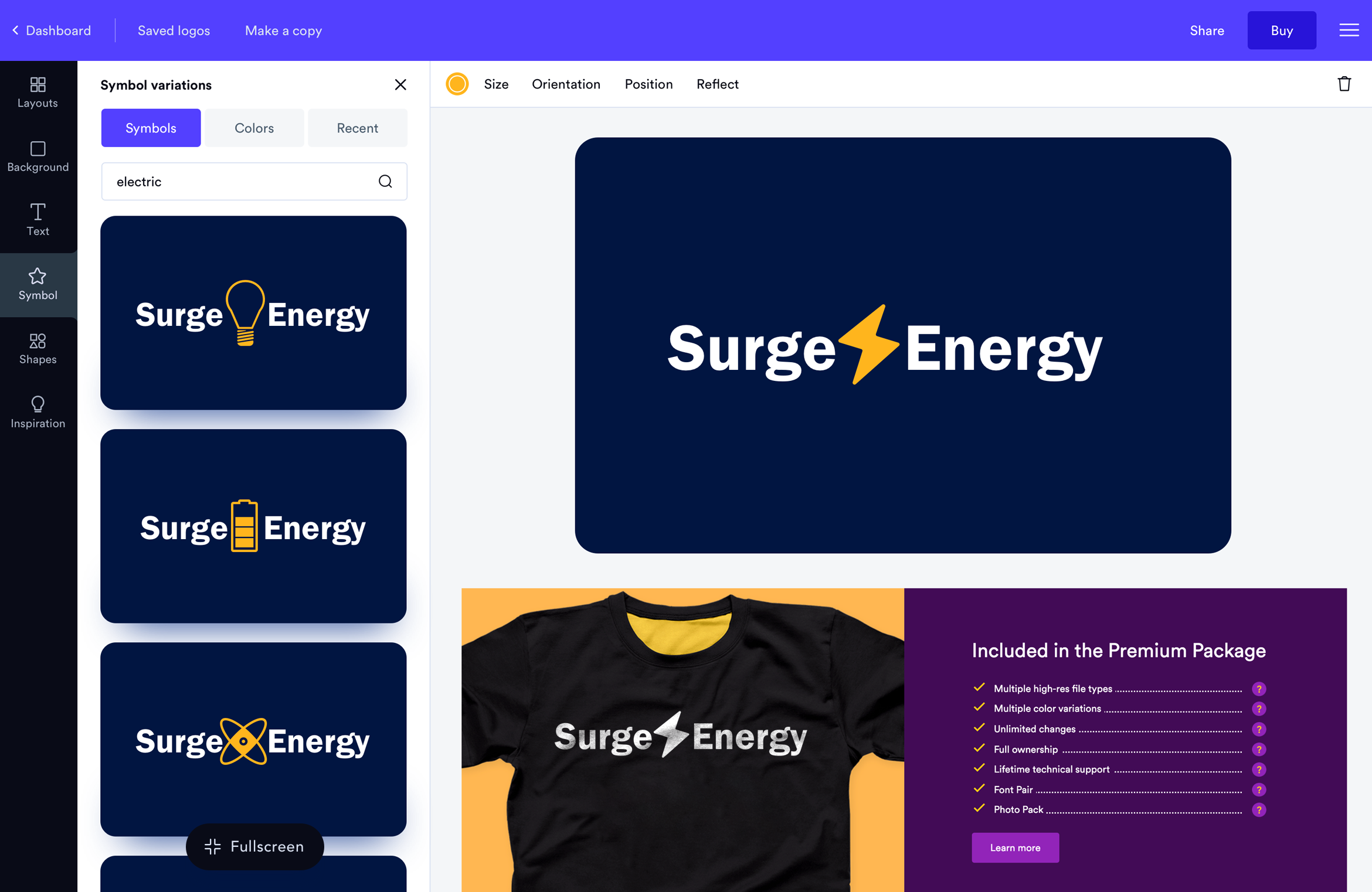
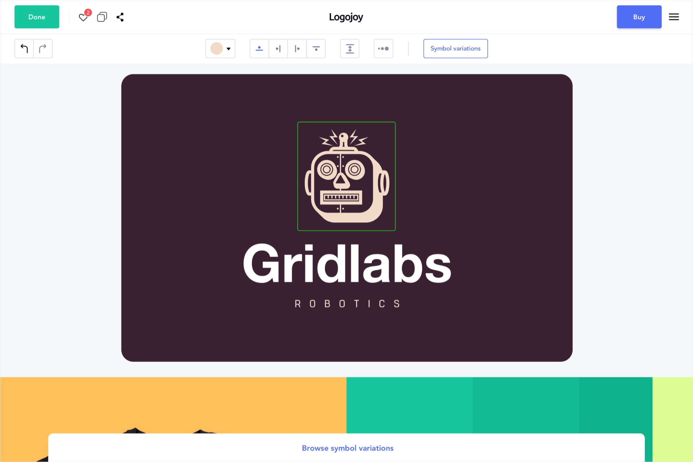
Redesigned font and symbol selector. Browsing felt like guessing before. The new selector made it fast to find, preview, and apply without leaving the flow. Live preview and filtering removed the extra steps.
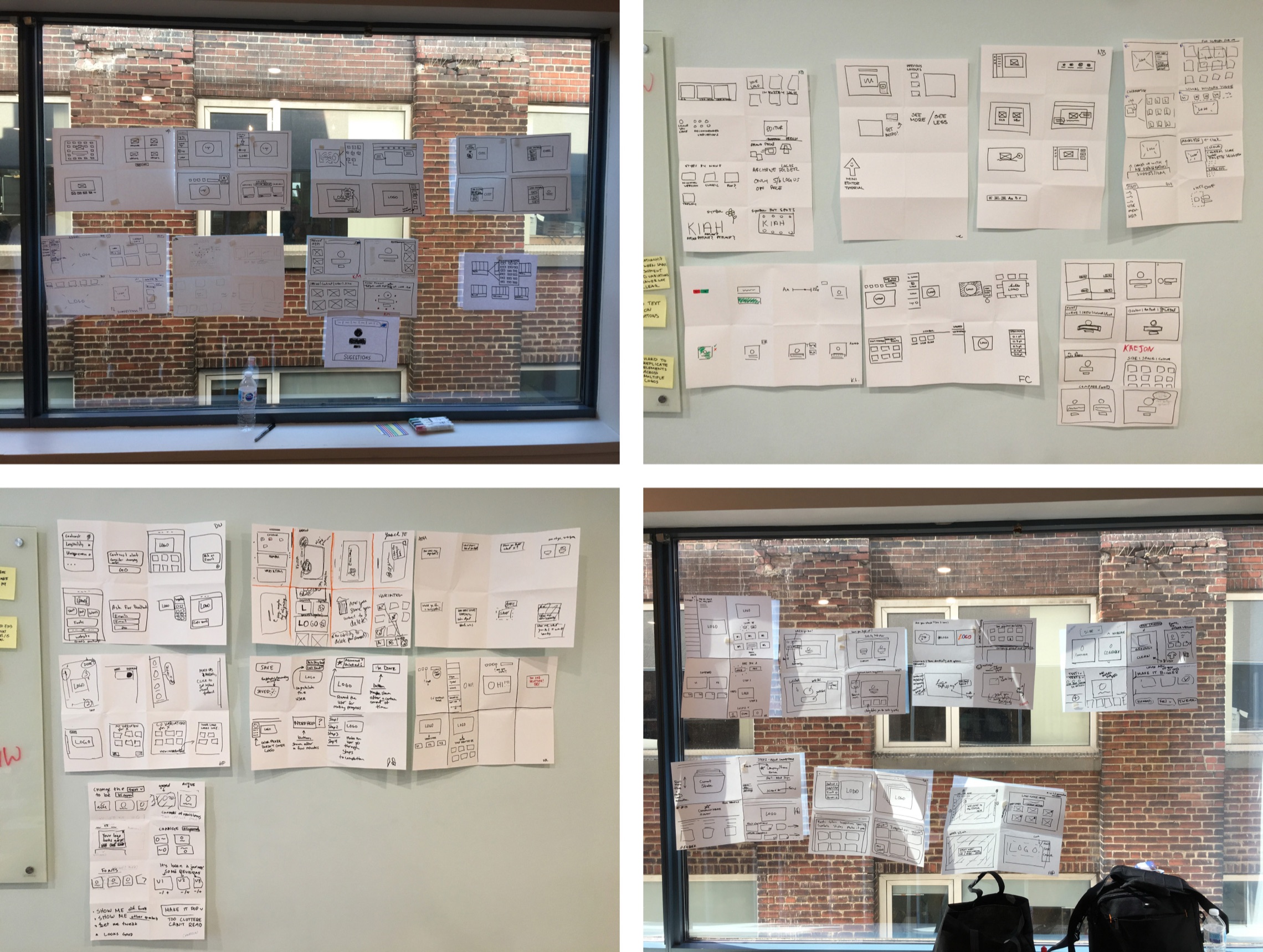
Wireframe sketches from the design sprint
Shipped
The goal was to build an editor that felt just as confident and capable as the AI that powered it, completing the experience it started.
- Labeled toolbar: every action named and scannable at a glance
- Comparison modal: compare variations side-by-side with full context
- Version history: explore freely and roll back without contacting support
- Font and symbol selector: faster browsing, filtering, and live preview
- Sidebar and variation modals: clearer layout and visual hierarchy
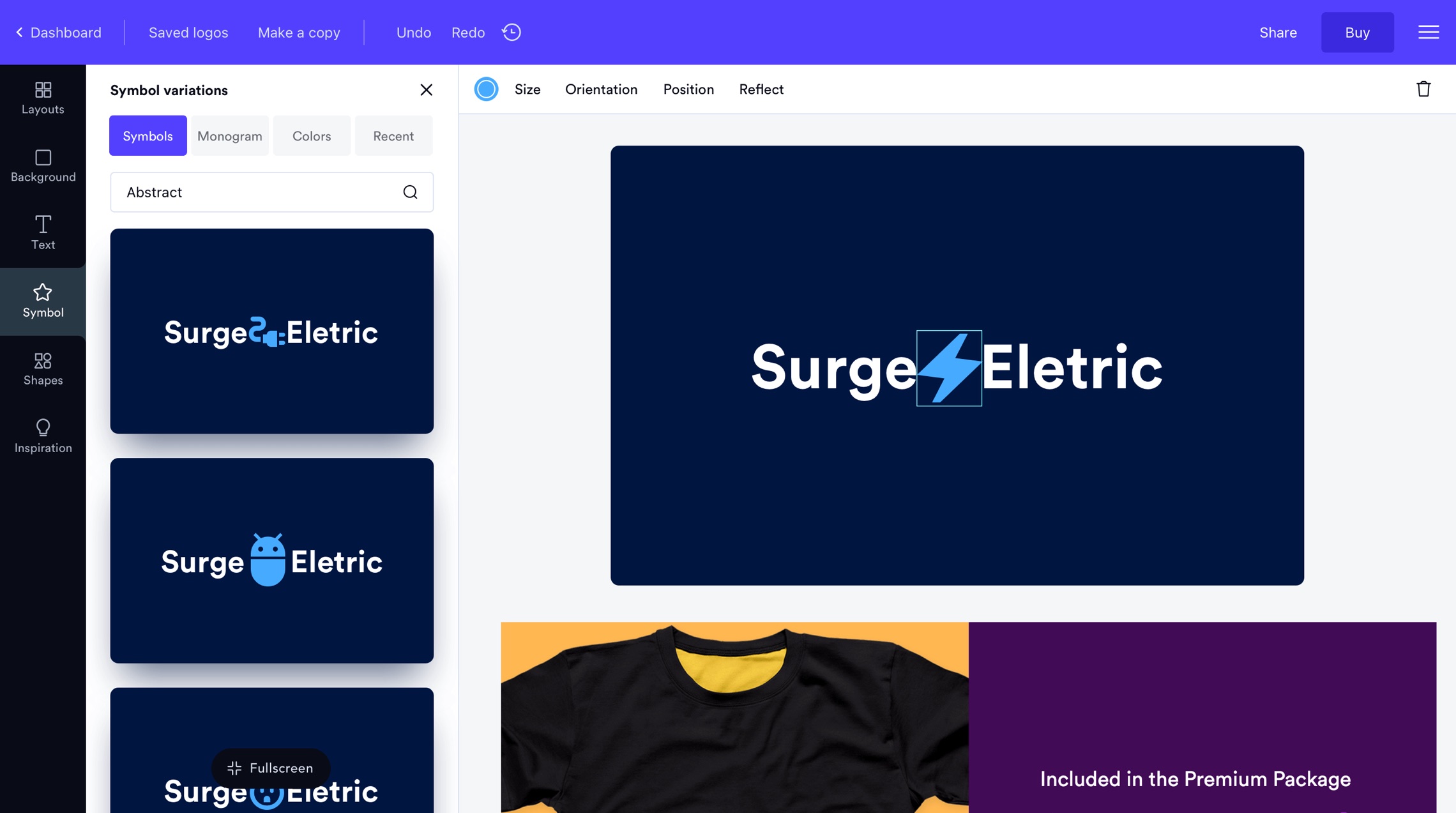
Symbol between text
Prototype
Before handing off to engineering, the prototype validated the new interaction patterns with internal stakeholders and an in-house user group.
The comparison modal and version history were the two flows that got the most attention. Both were high-stakes interactions that needed to feel effortless before any code was written.
Editor redesign with micro interactions and updated screens
Build
Every new pattern was documented before it went to engineering. Red-line specs, interaction notes, and component annotations were produced for the full redesign. Nothing was left to interpretation.
Handoff documentation covered the labeled toolbar, comparison modal, version history, and the updated font and symbol selector. Edge cases and responsive behavior were specified per component.
Developer documentation and red-line specs
Learnings
Small friction compounds fast. Toolbar icon confusion sounds minor, but it sits at the top of the editing funnel. Every confused user either contacts support, gives up, or buys without confidence. Fix the friction and everything downstream improves.
The comparison modal came from watching session recordings, not from asking users what they wanted. They described the problem. We identified the root cause. The solution followed from that, not from suggestions.
Reducing the cost of a mistake changes how people behave. Users didn't explore freely because they feared losing work they cared about. Version history removed that fear. Bolder edits, more iteration, better outcomes. Sometimes the right design move is making it cheaper to be wrong.